What do the disparities look like in the area where you live?
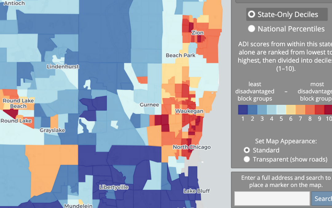
For #MapCritiqueMonday I want us to look at this dataset on the Area Deprivation Index (ADI). It “It allows for rankings of neighborhoods by socioeconomic disadvantage in a region of interest (e.g. at the state or national level). It includes factors for the theoretical domains of income, education, employment, and housing quality. It can be used to inform health delivery and policy, especially for the most disadvantaged neighborhood groups.”
What are your thoughts on how this data is communicated?
1) This seems like a very legit project. If you go to the about page (https://www.neighborhoodatlas.medicine.wisc.edu/#about-anchor) you will get information on publications etc. But I am not seeing a good solid explanation of really how to use the data. I think that is problematic especially when they have a nice map UI. I would like some of those limitations/explanations to be put on the web map itself.
2) The Edge Effect Matters! I get that for many policy interventions that are done at the state level. However, it would be great to be able to create an index based on selecting a few counties. It would also be great to be able to compare moving across state lines (ex I live in the northernmost county in Illinois). That said, they do make the data available for download!
Source: https://www.neighborhoodatlas.medicine.wisc.edu/mapping