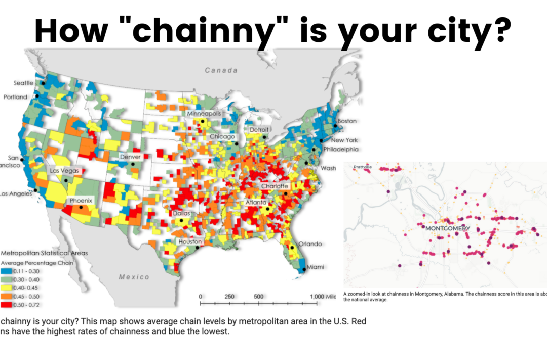
How dominant are chains in your city? For the latest in our #MapCritiqueMonday series, we are going to look at a recent mapping project led by Clio Andris, assistant professor of city and regional planning and interactive computing at the Georgia Institute of Technology, and planning graduate student Xiaofan Liang, gestures at the corporate dining terrain that already defines much of the country.
What is #MapCritiqueMonday?
#MapCritiqueMonday is a fun practice that I started to encourage a conversation on social media. This is a way for people to respectfully come together to look at a piece of visual communication and provide feedback. The goal is not to “tear down” work but to collectively point out areas of improvement.
From the Bloomberg Article:
Using a dataset of nearly 800,000 independent and chain restaurants for the contiguous U.S., Liang and Andris crunched the total number of restaurants with the same name and created an average “chainness” score, which measures the likelihood of finding the same venues in other parts of the country depending on the geographic scale. For example, the national score is 1,247, but just 28 in San Francisco, where there is a high concentration of independent restaurants. In parts of the South, the score is over 1,900.
What stood out to me from the analysis and map:
- Cartography: I think that the “drop shadow” can sometimes be over-used in the world of maps. I know when I first got into illustrator that I used it on EVERYTHING. That said, I think that the 3-D effect of the map works really well.
- Geography for Analysis: The analysis is aggregated first to the CBSA, which is a US census designation. The CBSA includes areas that are smaller than the counties and can cross states. It describes a “metro” area. I think that this is a great way to start. However, as you can see on the map not every place in USA is in a CBSA Metro Area (think rural areas). I think that the rural component is missing from this analysis.
- Localized: I appreciated the “zoom in” perspective where we could see the “chaniness” of a given area. In the write-up at least from Bloomberg, there was no legend present. I am sometimes the WORST at putting legends on my maps and this is an important reminder of why it matters. What are the colors? What do the sizes of the dots mean?

Are you interested in amping up your analysis and you’d like to chat about implementing an analysis like this for your organization? Drop me a line or let’s set up a time to chat!
