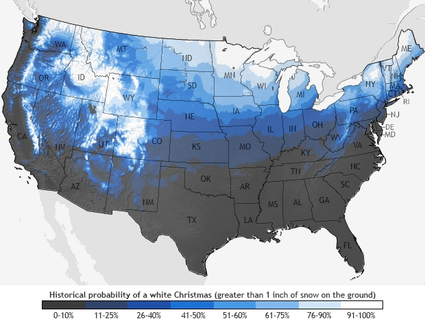
Are you dreaming of a white Christmas? Well, today on #MapCritiqueMonday let’s chat about this #WhiteChristmas map from the US Weather Service.
A few things strike me:

- I’d love to have more context on the map– like major city names. I know that will clutter the map some, so I understand the decision to not put them on the map. However, I do think that I’d rather have major city names on the map than State names. I am curious which grouping the Twin Cities (MN) are in.
- The State Labels are off. I think that they may need a “halo” or a buffer around the text. It is very hard to see Arizona and California’s labels. Also, I don’t understand the label placement of AZ, NM, and CO.
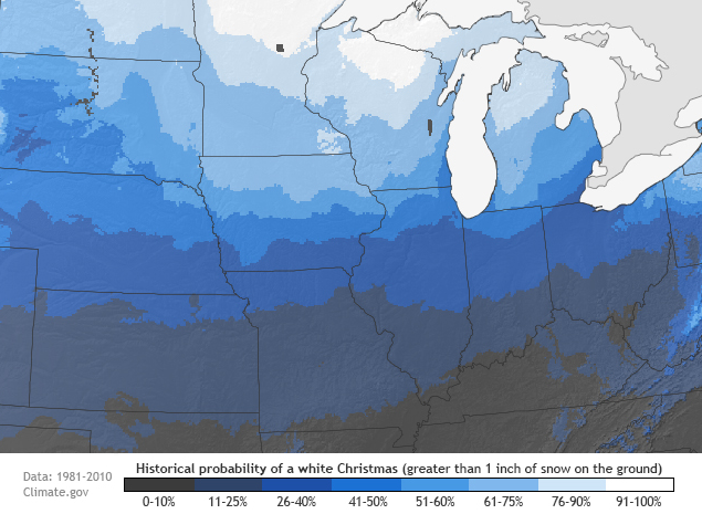
- Definitions aren’t on the map. There’s no definition on the map above of what “historical means.” There’s another map on the site, just of the midwest, which does include the years involved in defining “historical.”
Source: https://www.weather.gov/images/dvn/Climate/ChristmasSnow.png
What am I missing in this critique of this Christmas snow map? What other feedback do you have on this Christmas map?